SOLARISE
We specialise in custom web development and scalable platforms. Laravel applications and high-performance WordPress sites that power your business.
Start a ProjectSenior Technical Partners
We build data-heavy web applications for businesses that have outgrown basic websites. Based in Edinburgh, shipping globally. We specialize in taking messy, complex requirements and turning them into boring, reliable software.
We've built Salesforce-WordPress integrations for Kurt Weill Foundation. We love building custom Laravel applications for complex event management. WordPress is a powerful solution when architected properly - we build sites that clients can actually maintain themselves.
Technical: Laravel (1.7M+ sites built with it), WordPress (60K+ users), Vue.js, Alpine.js, CI/CD pipelines, API design, TDD.
Client-facing: We translate technical complexity into plain English. No jargon. No BS. Just clear communication and code that solves your actual problem.
What We Build
Custom Laravel Applications
Automate complex workflows and manage data at scale with bespoke platforms. Built for stability and long-term growth.
WordPress That Works
Secure, high-performance sites that your marketing team can actually use. Custom blocks, no bloat, perfect SEO scores.
System Integrations
Connecting CRMs, ERPs, and payment gateways. If it has an API, we can integrate it. Eliminate manual data entry errors.
Frontend (Vue/Alpine)
High-performance interfaces. No lag, no layout shifts, just smooth interaction. Built for speed and usability.
DevOps & CI/CD
Sleep soundly. Automated deployments, uptime monitoring, and zero-downtime updates. We handle the servers so you don't have to.
Technical Strategy
Audit & Roadmap. Identifying bottlenecks and planning for long-term stability. We find the problems before they break your site.
Specialist Platforms

The AI Advantage
We use AI as a force multiplier, not a replacement. By automating the repetitive parts of coding, we spend more time on architecture, security, and solving your actual business problems.
See How It WorksSelected Work
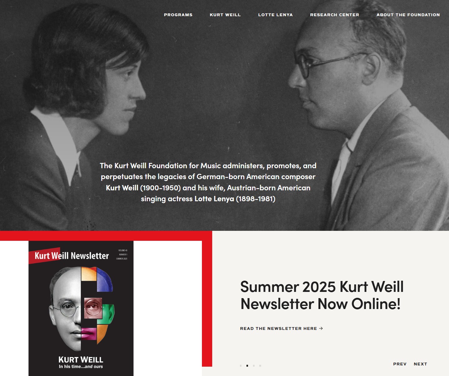
Kurt Weill Foundation
Challenge: Sync 10K+ records between Salesforce and WordPress without duplicates.
Solution: Custom webhook handlers, PHP SDK wrapper, intelligent scheduler.
Stack: WordPress, Salesforce API, Custom PHP
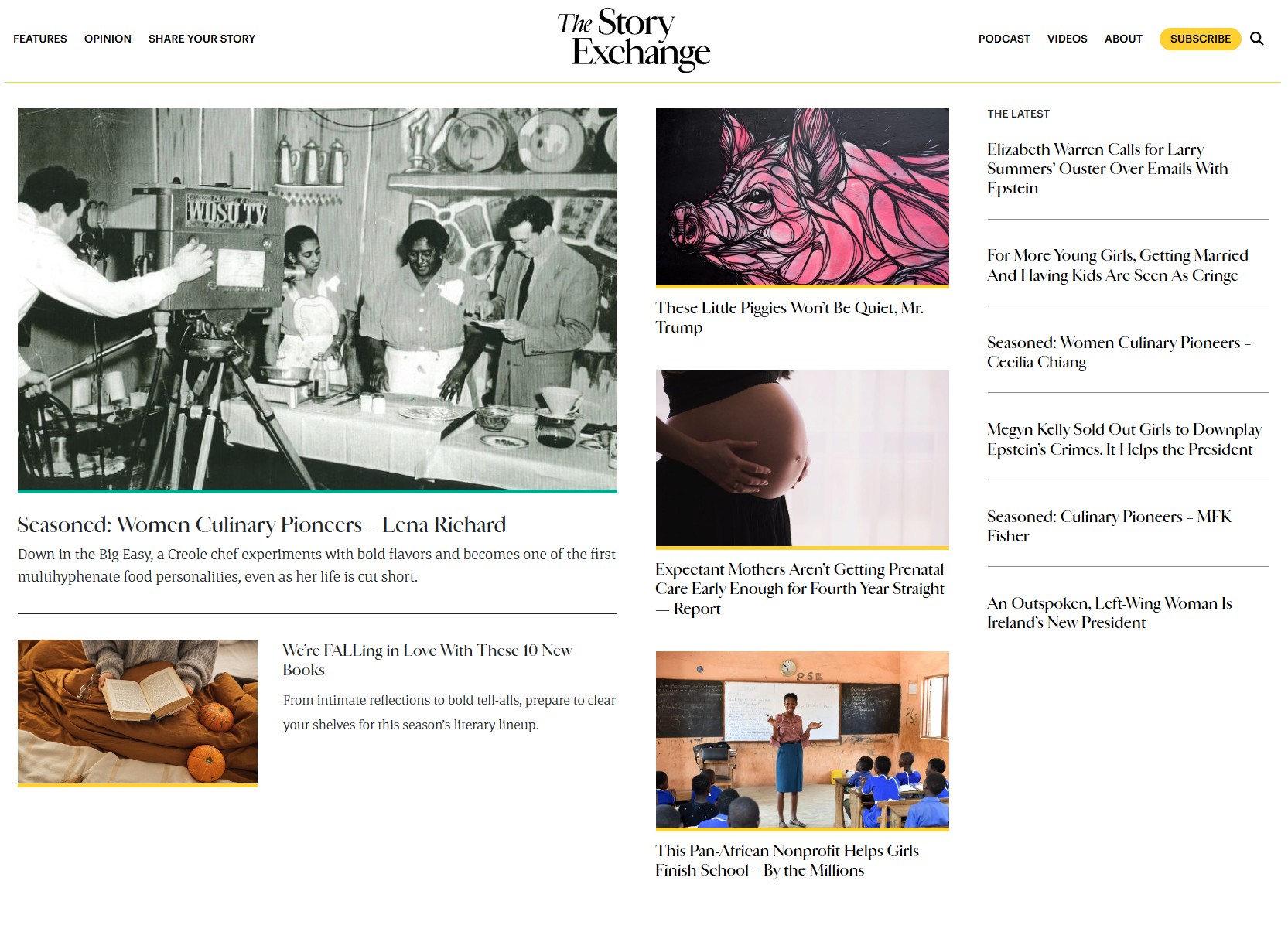
The Story Exchange
Challenge: High-traffic non-profit media organization requiring stability and scalability.
Solution: Enterprise WordPress architecture, custom caching layers, and legacy data migration.
Stack: WordPress, PHP, MySQL, Nginx

Nyde.co.uk
Challenge: Luxury furniture e-commerce with bespoke configuration.
Solution: Custom "Lookbook", interactive color pickers, brand management.
Stack: WooCommerce, Custom Plugins
How We Work
Discovery
What's the actual problem? We dig into your requirements, ask uncomfortable questions, map data flows. No assumptions.
Architecture
Tech stack proposal. Database schema. API contracts. You see the plan before we write a line of code.
Build & Test
Iterative development. Regular check-ins. Automated testing. GitHub for full visibility. No surprises.
Deploy & Support
Documented deployment. Knowledge transfer. Support retainer available. You own your code.
Client Feedback
Start a Project
Based in Edinburgh. Work with clients globally.